Project

Rembrandt House Museum, Amsterdam

A restoration and a new look

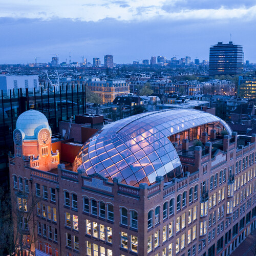
When the Rembrandt House Museum in Amsterdam decided to restore the seventeenth-century house to its original state and enable it to offer an insight into the circumstances and ambiance in which Rembrandt lived and worked, a new space had to be found for the exhibitions, the library and the museum shop. That space was found in the nineteenth-century house next door, known as Saskia’s House, which was thoroughly renovated at the same time.

New facade and roof for the Rembrandt House Museum

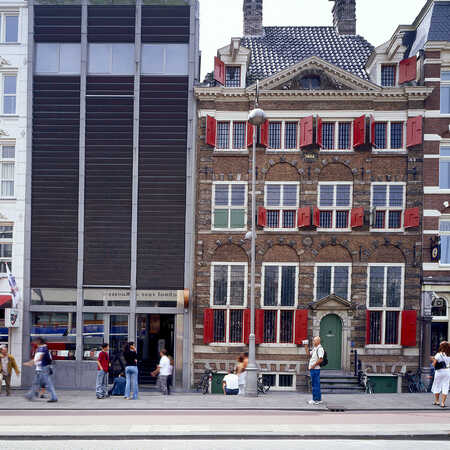
The design for the facade and roof of the museum by architectural studio ZJA arose out of an analysis that showed the front wall needed to make a visual connection between the experience of the historic building and Rembrandt’s work and the contemporary environment of exhibition space, shop and entrance, but in such a way that the new facade fitted into the row of frontages.

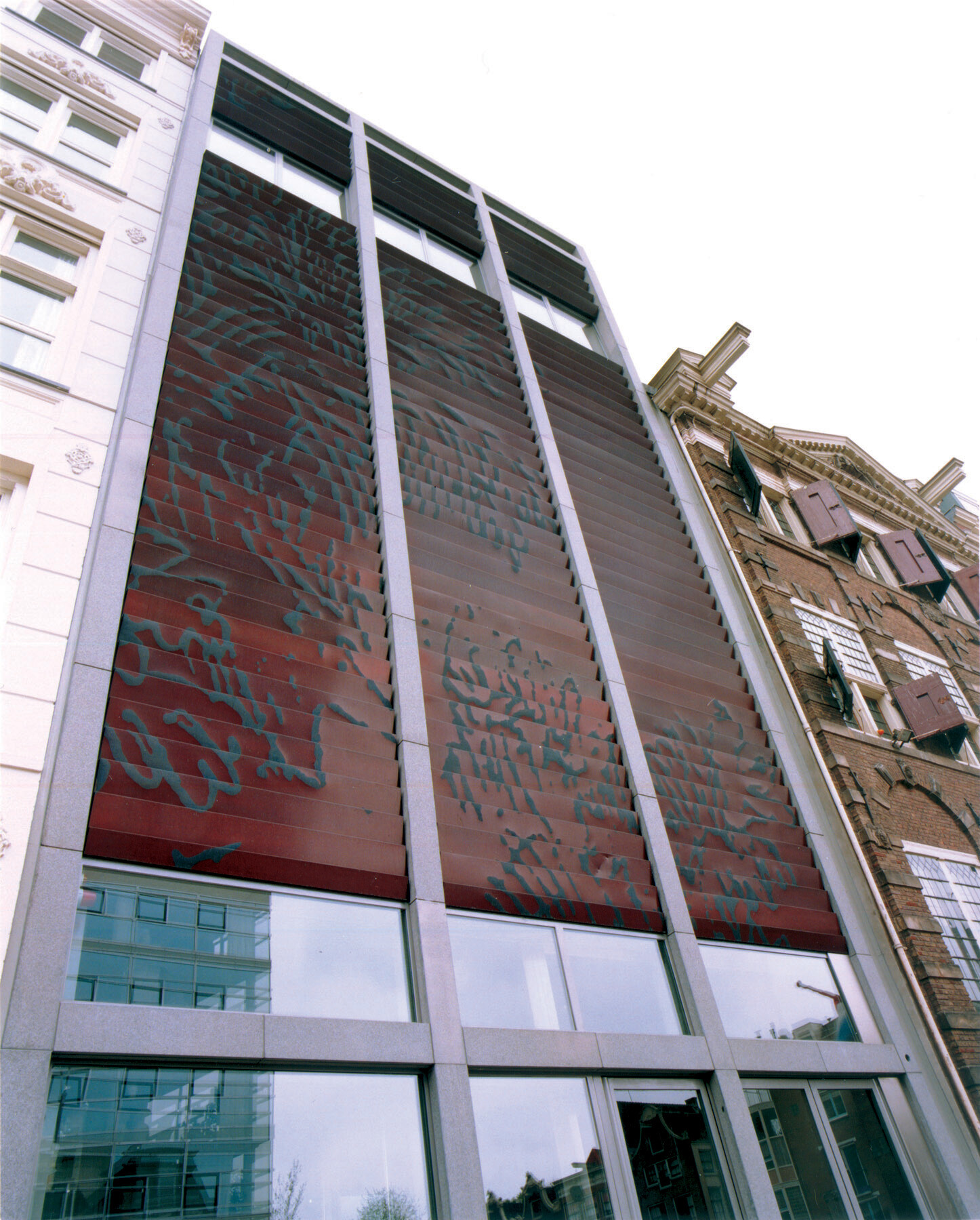
So a classic division into three can be seen in the ZJA design: a transparent ground floor, for the entrance, a more closed middle section behind which is the light-sensitive collection of drawings and etchings, and above it a level with windows for office space, all behind a facade that leans forward very slightly, like that of the Rembrandt House next door.

The stone cornice marks the divergent part of the roof structure behind which are the library and the space for technical installations. That same stone is used for the vertical division into three, designed to be in keeping with the proportions of the facades of neighbouring houses.


A facade of playful copperplates

The facade itself is separate from the building and is made of folded copper plates. The horizontal strips become broader the higher up they are. Yes, the material chosen refers to Rembrandt’s copperplates – after all, you are standing at the place where he made and printed his etchings. There is a specific spot on the pavement opposite from where you can see on the facade a magnified detail from Rembrandt’s etching Isaac and Jacob. It is made up of quirky lines that have been sandblasted into the copper surface and bronzed. Playful and lively, they crawl across the entire facade, and because you can’t easily discern exactly what you’re looking at, the picture works as an invitation to go inside and immerse yourself in the stories portrayed by that same hand.

Architect: ZJA
Year: 1998
Project: #141

Related

Project

AMFORA, Amsterdam

A visionary plan

Like all cities, Amsterdam faces increasingly limited space to accommodate more and more people who want to live, work and spend their…

Read more
Project

Diamond Exchange, Capital C Amsterdam, Amsterdam

New life for a monument

Historically an exchange is the meeting place of markets and people, goods and ideas, and that is how the renewed Diamond Exchange meets…

Read more
Project

Renovation Climate Greenhouse Hortus Botanicus Amsterdam

The eye-catcher of the  Amsterdam Hortus Botanicus was designed in the early 1990s by architectural studio ZJA, as a contemporary structure…

Read more
Project

Freedom Museum, Groesbeek

Parachute in the landscape

Amid the green hills rises the impressive white dome of the new Freedom Museum in Groesbeek. The museum is shaped like a giant parachute…

Read more