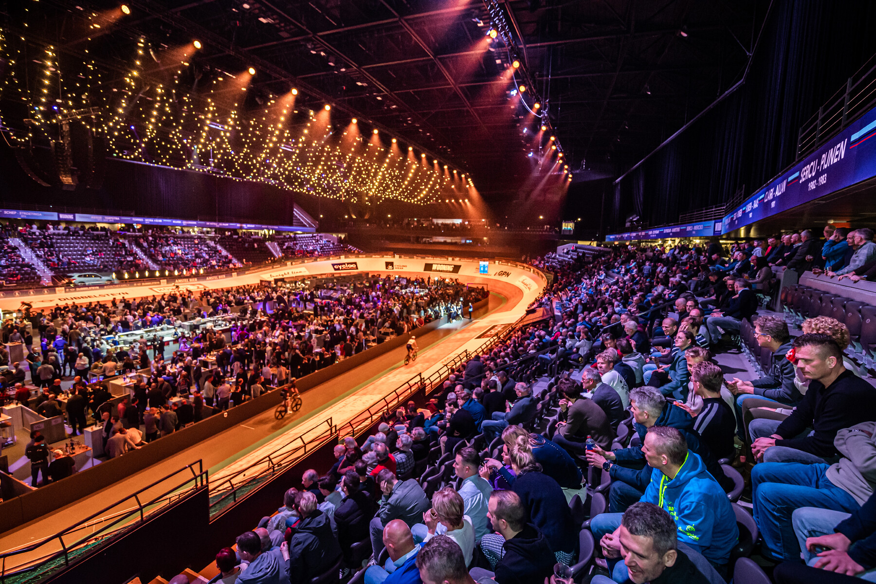
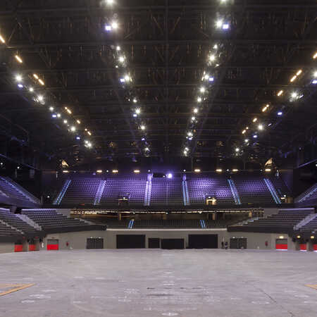
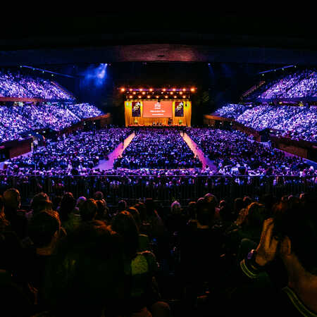
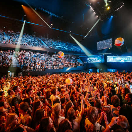
In tune with the city’s mentality the old Rotterdam Ahoy was designed as a no-nonsense events venue. As soon as the show was over you were glad you could leave. The modernization of Rotterdam Ahoy instructed the architectural studio ZJA to not only increase the capacity of seats, but to also upgrade the visitor experience. The objective was to give people visiting and walking around Ahoy a pleasant and welcoming feeling. The new Rotterdam Ahoy was to convince you to come early and stay a little longer when the concert or the match were over.
Smart renovation
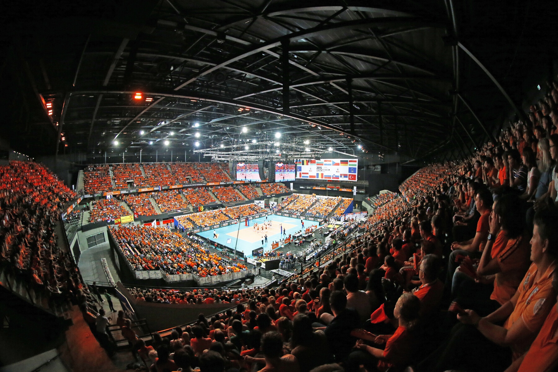
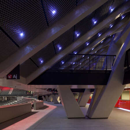
A small increase in square meters was introduced around the new entrance. But most of the improvements draw little attention, despite increasing flexibility and capacity. The roof’s height was increased, and the frame and rafters were strengthened to carry a greater load, making sure the most recent and toughest requirements concerning light and sound installations could be met. Trucks delivering parts for the stages, the velodrome or the BMC-track have much better access.
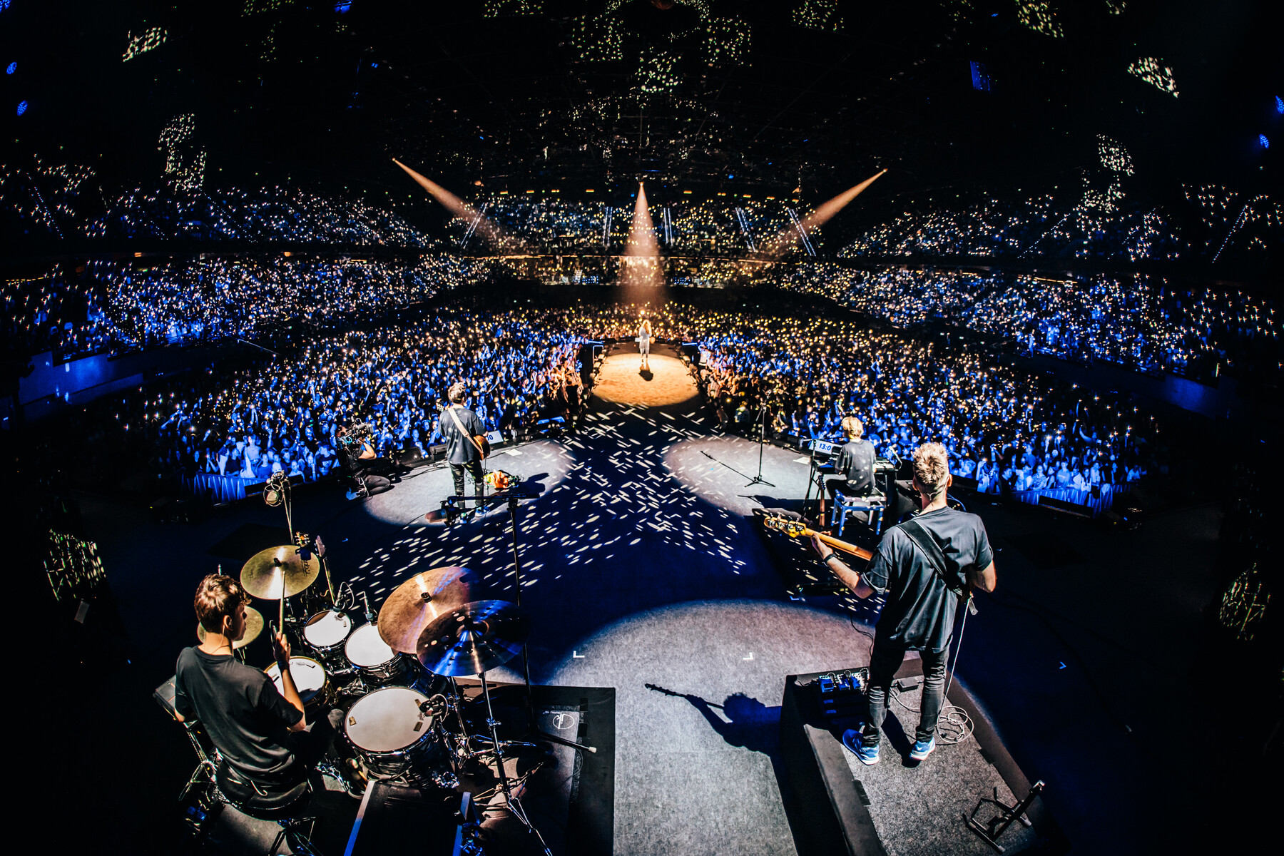
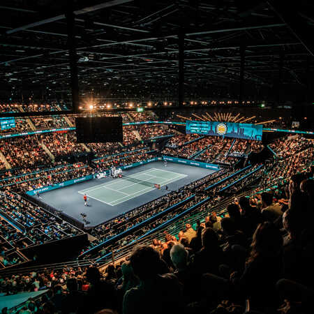
In collaboration with interior architects Merkx+Girod ZJA reconfigured the lay-out of the ground floor and the first floor. Visitor’s squares were created around which bars, shops, rest rooms and cloak rooms were situated. There is a new gallery connecting the existing stands, producing a much more intimate and pleasant atmosphere. The new design allows for the stage to be put anywhere, ranging from an intimate concert with 3.000 seats to a mass event hosting 15.000 visitors.
Variety of settings
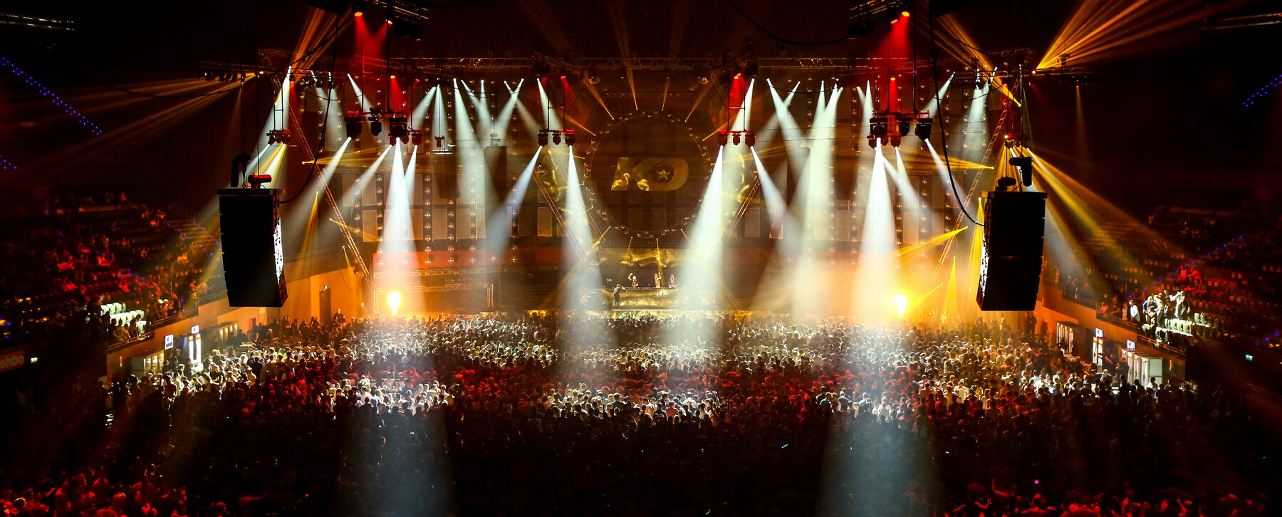
By choosing dark colours for the ceiling and the installations in sight a neutral backdrop is created, allowing the evocation of a wide variety of settings and atmospheres by lighting and staging. The backside of the stands are clad with a sheet of metal gauze, through which the lights shine playfully. It suggests a starry night and adds a playful visual element to the space. Clear signing on the floors and bright colours indicating the location of bars and outlets make sure the visitors have overview and find their way in a hospitable setting.
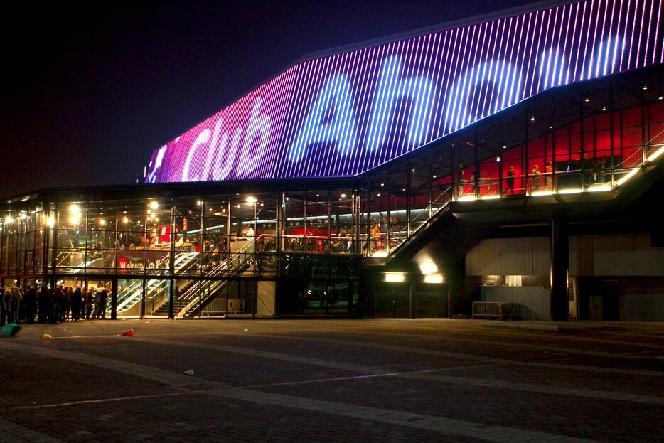
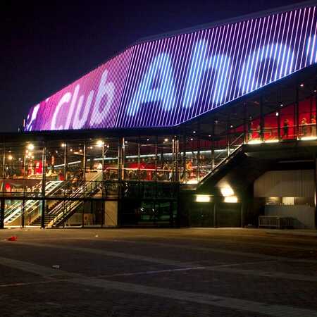
For passers-by and as a first impression Rotterdam Ahoy appears new as well. The entrance is no longer a dark facade, but a transparent and light space, drawing one’s attention inside and towards the inviting interior. A large LED screen provides lively communication of the ongoing program. That program can range from technology fairs to monster truck shows, but also a jazz festival or a kickboxing gala. Rotterdam Ahoy offers this great diversity of events, inviting you to dine and drink with your friends. The city’s playground has become a little more like a living room.
Gallery
Award
Nominated for the Stadium Business Awards 2011
Architect: ZJA
Client: Ontwikkelingsbedrijf Rotterdam
Interior designer: Merkx+Girod
Year: 2011
Project: #442
Photographs: Luuk Kramer, Ahoy Rotterdam, B2B.
Related
Timeless Box, Skybox Johan Cruijff ArenA, Amsterdam
Have you ever noticed the waves that hide inside brown cardboard boxes which move silently and unobtrusively through the world? They are in…
AMFORA Amstel, Amsterdam
A visionary plan
The old Amsterdam, built in a swampy delta next to an arm of the sea, is a city in the water. Using modern building techniques, its huge…
Venue Building Silt, Middelkerke
Striking building at the Belgian coast
Both inspiring and principled, venue building Silt Middelkerke is an asset to the Belgian coast in several respects. With great love of the…
AMFORA, Amsterdam
A visionary plan
Like all cities, Amsterdam faces increasingly limited space to accommodate more and more people who want to live, work and spend their…
