Two different facades
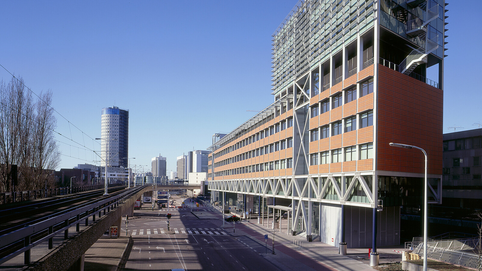
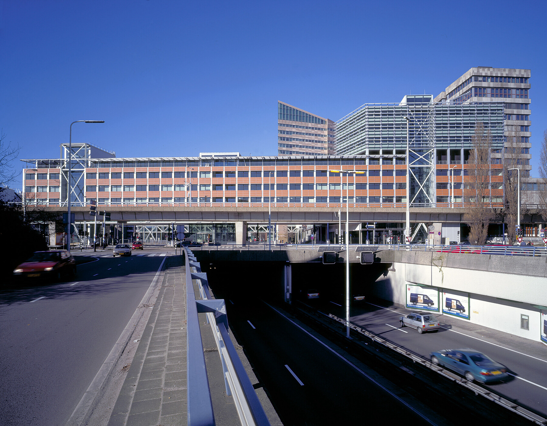
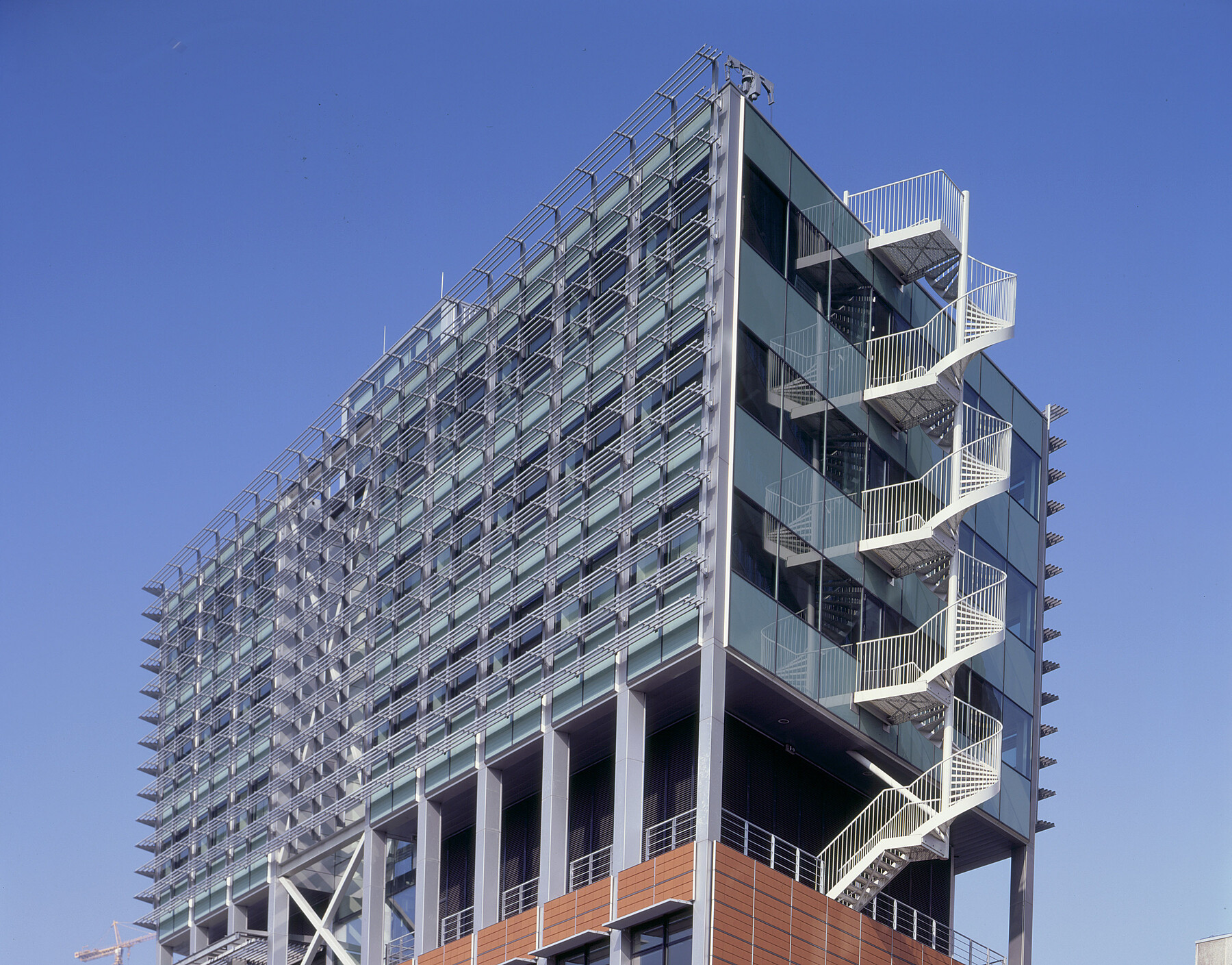
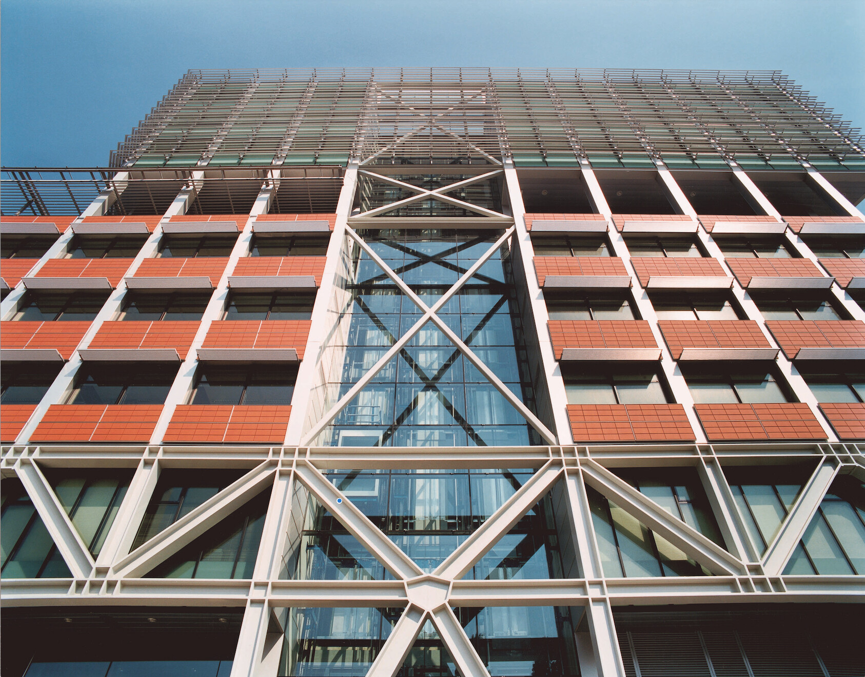
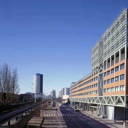
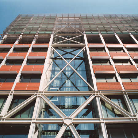
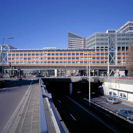
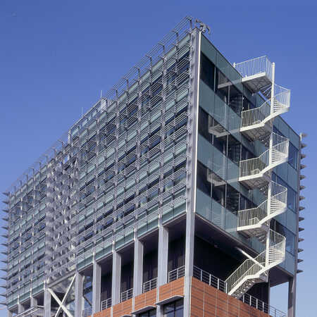
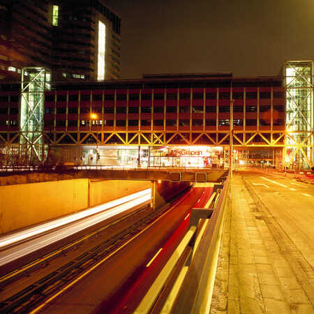
The buildings on the Grotiusplaats have strikingly different facades. Both have a glass curtain wall on the side facing the square and a facade of hollow brick-red tiles on the other side. The addition of stone and colour, and the way the upper floors are set back from the frontages behind the steel lattice trusses, make the design fit with the urban environment. To avoid the impression of a minuscule ant among tall glass towers, the urban design concept also provides for Z-shaped, stepped building volumes. The buildings are spacious, and with regard to material, shape and colour they form a lively addition to the city.
The buildings have a light, open character, but the eye-catching trusses also add to the environment, with diagonals that are reflected in the steel cores. Unusually, the steel load-bearing structure has been left without cladding. Research was carried out into the building’s fire safety, and the large, free, open steel surfaces were shown to ensure a rapid release of heat into the atmosphere in case of fire, which meant that fire-resistant cladding was unnecessary.
