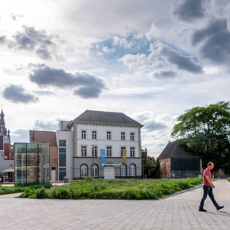
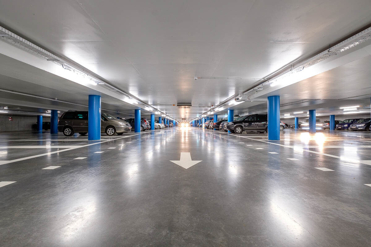
Bordering the historical city centre of the city of Kortijk in Western Flanders are two parks, Begijnhofpark and Stadspark. Right in between those two parks lays the Houtmarkt, formerly a place where visitors to the inner city and the health care centre St Vincentius parked their cars. The new parking garage that the architectural studio ZJA has designed in collaboration with SBE not only houses 170 cars but also offered the opportunity to build an inviting city square.
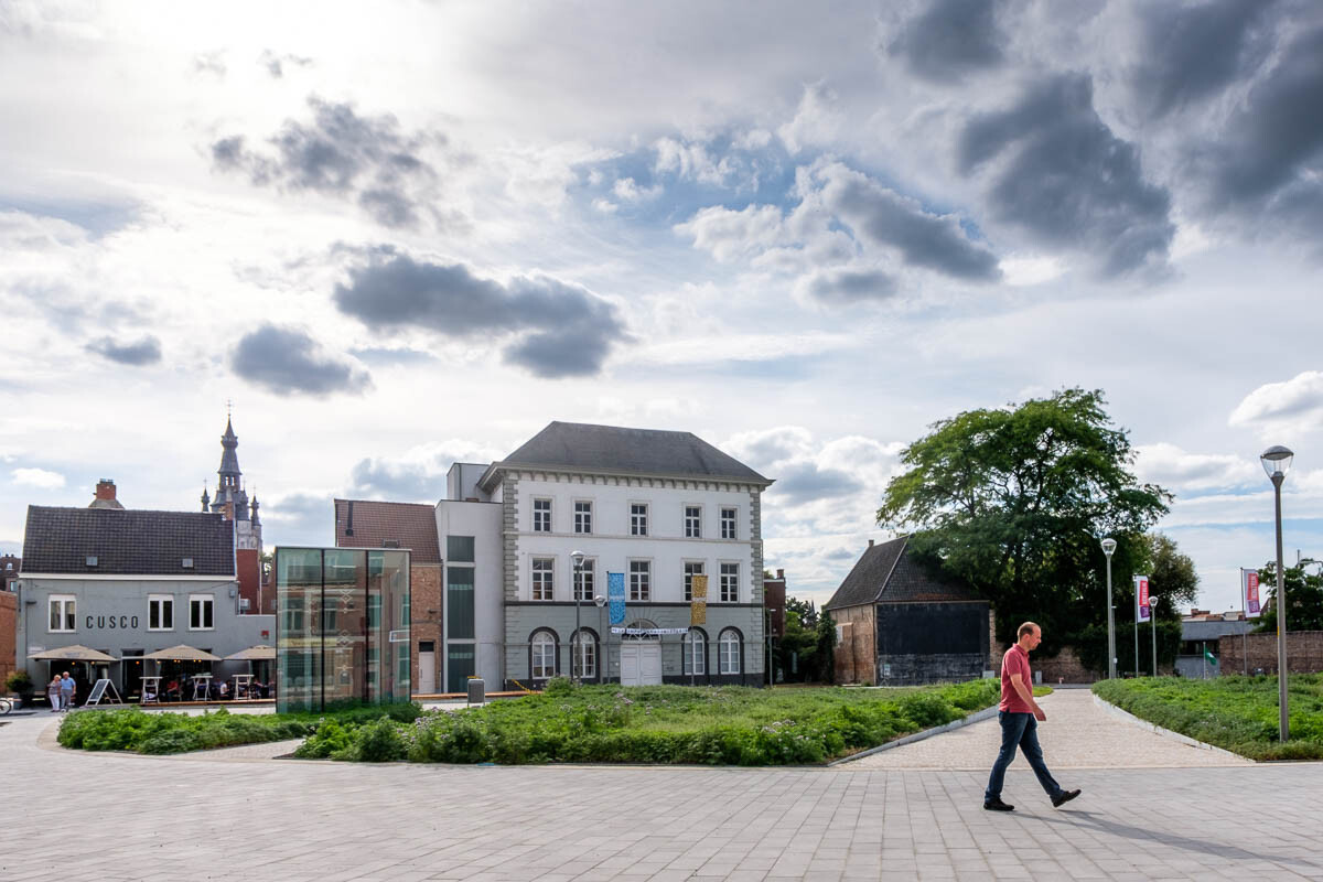
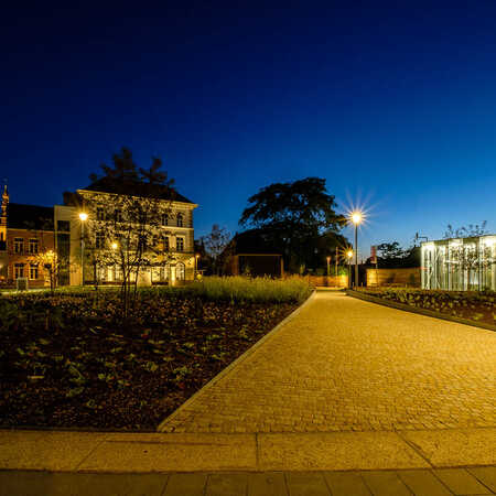
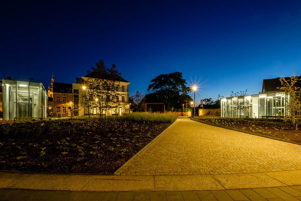
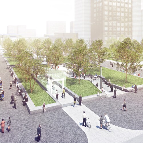
What used to be a dreary parking lot is now a green square. OKRA Landscape Architects was responsible for the lay out of the new Houtmarkt and by means of paths that vary in width and follow flowing lines, they created a square that has a spacious and comfortable effect.
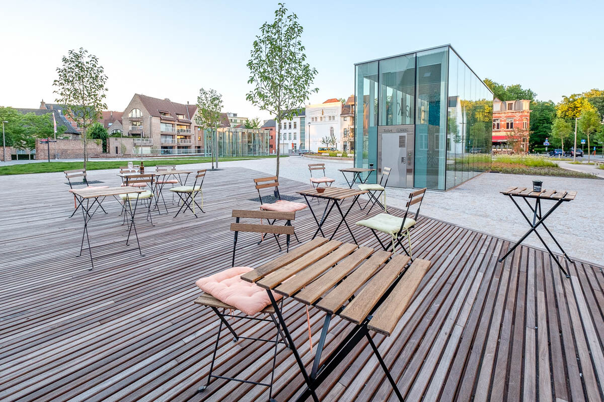
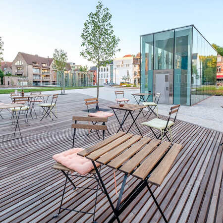
The wooden clad deck, suggesting a terrace and the addition of greenery even give a hint of a city garden. The pedestrian routes crossing the Houtmarkt offer comfortable and direct connections to the most visited locations.
The glass pavilions
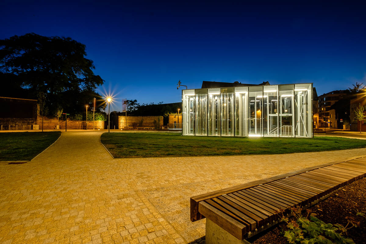
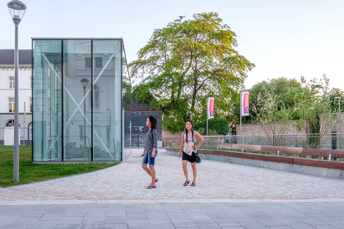
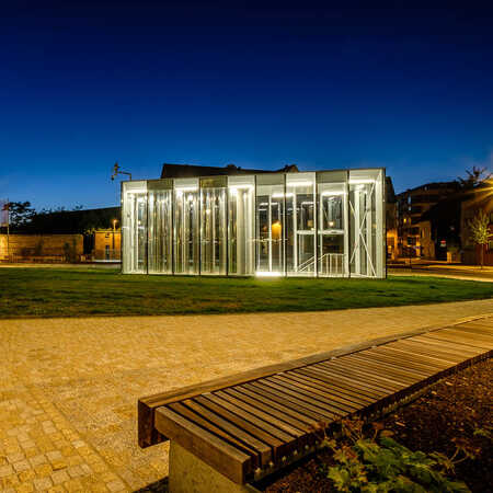
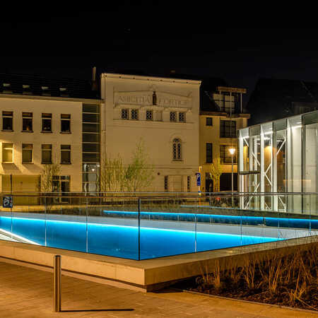
In strategic places, among waving reeds and grasses, two transparent pavilions are built giving access to the parking garage. One houses a public toilet as well, the other only functions as an exit and accommodates four ventilation shafts.
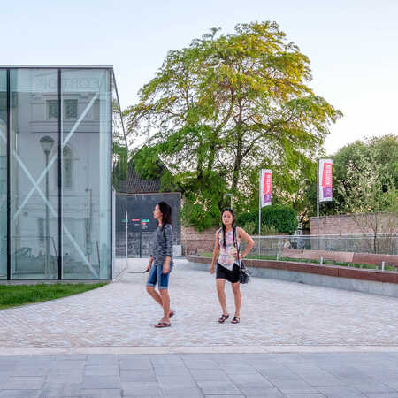
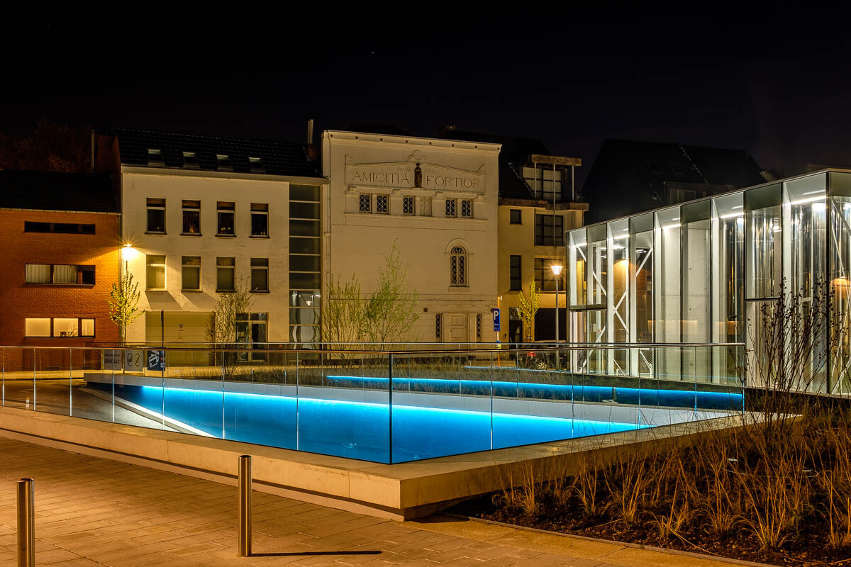
The pavilions merge with the built environment in terms of lines and rhythm. But they are more than just performing their useful function in a minimalistic fashion; they are in their shape and materialization outspoken visual additions to the Houtmarkt.
.
They add an atmospheric element and provide a feeling of safety through the light they shed onto the square after sundown. The touches of blue light around the entrance and the matte steel profiles of the glass pavilions blend into a clear and contemporary look.
And in passing the ventilation shafts you might suddenly ask yourself: these chrome pipes, so provocatively shining and openly displayed behind glass, are they really only pieces of machinery? They are fascinating to watch and to notice how they reflect the light and the images of passers-by. It is the kind of moment that fits well into the light and open atmosphere that has been established on the square
Gallery
Harmony without severity
The purpose was to build a zone with minimal car traffic next to the city centre and still offer the convenience of reaching the inner city by car. The clear and functional design of the parking garage, with its entrance situated at one side of the square and the playful transparent pavilions are an integral part of a green city square.
Open and harmonic space
The Houtmarkt has been transformed into an open and harmonic space without a hint of severity, where the greenery, and the subtle swaying lines and transparent elements create an environment that connects the two city parks but also makes you want to linger. Everything in the design is focussed on convenient and easy use of a functional, safe parking garage. But in doing so, it aims to strengthen the qualities of the environment and turn the Houtmarkt into a green city square and a valuable asset for the city.
Architect: ZJA
Principal: Stad Kortrijk
Consultant: SBE
Landscape architect: OKRA Landschapsarchitecten
Year: 2016
Project: #727
Photographs: Kattoo Hillewaere
Related
Bicycle parking Mahlerplein, Amsterdam
The Zuidas in development
The expansion and renovation of Station Zuid is giving a great boost to the Zuidas as a new city district. The open, multi-level park…
Pontsteiger parking garage, Amsterdam
Along the water
Just west of Amsterdam’s Central Station a new extension of Amsterdam is being built. Of the three Houthavens (Timberdocks), the middle one…
Venue Building Silt, Middelkerke
Striking building at the Belgian coast
Both inspiring and principled, venue building Silt Middelkerke is an asset to the Belgian coast in several respects. With great love of the…
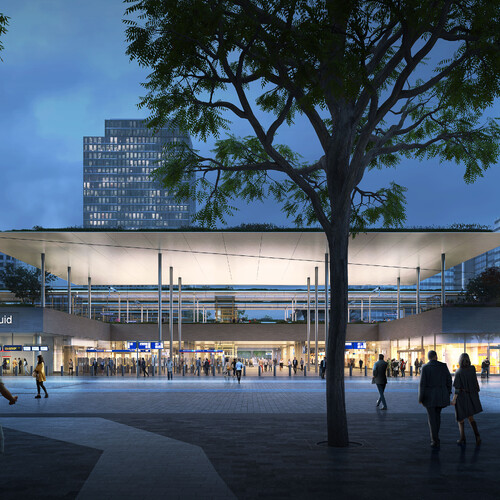
Zuidasdok, Amsterdam
Where the city is bursting at the seams
As befits any major urban expansion, plans for the area around the Zuidas in Amsterdam are ambitious in the extreme. The aim is to…
